Subject Line
Colourful Comparative View of Data
Overview
Sometimes you may want to compare data by using colours. Heat map is a visual display that quickly shows you a comparative view of the data with the use of colors. To create a heat map you have to use conditional formatting.
Conditional formatting includes the below options:
- Highlight cell rules
- Top and bottom rules
- Data bars
- Color scales
- Icon sets
Working
We are going to use Color scales option to create Heat map.
Let’s understand the working with an example.
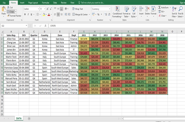
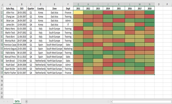
We have (Figure 1: Sales Report) and have to find the pattern of sales (using heat map) for the Sales Rep. from the Year 2011 till 2018 based on their values. We will find it difficult using the numbers so we take the help of Heat Map to find pattern.
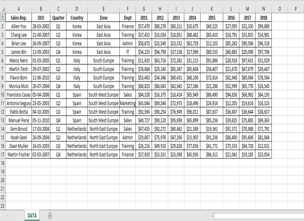
Figure 1: Sales Report
Step 1: Select the range (G2:N17)
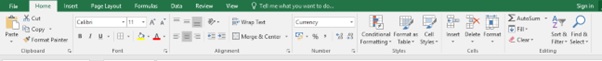
Step 2: Go to HOME tab
Step 3: Click on Conditional Formatting in the styles Group
Step 4: Go to Color Scales
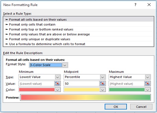
Step 5: Click on More Rules
Step 6: New Formatting Rule Dialog box appears
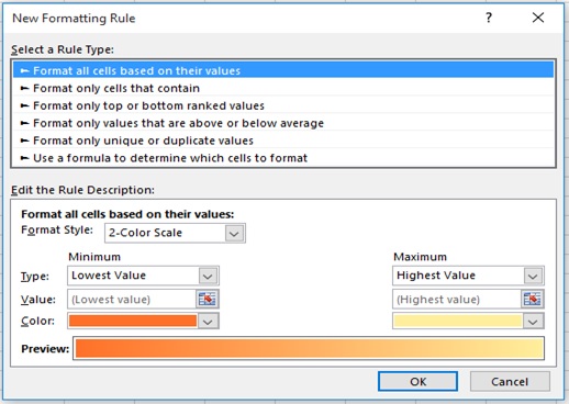
Step 7: Select 3-Color Scale from the Format Style drop down.
Step 8: Click on OK
Step 9: Select the range (G2:N17)
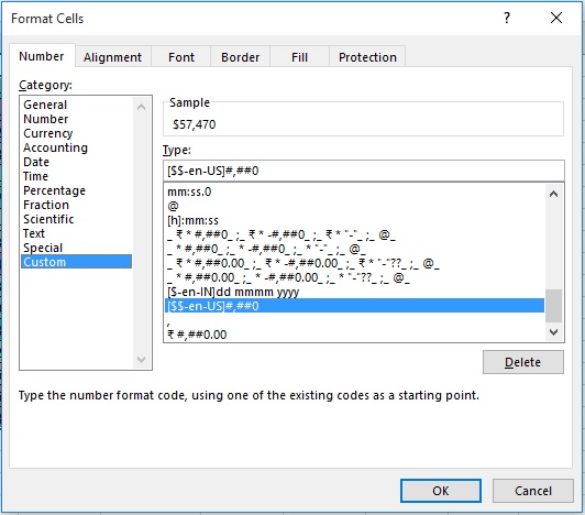
Step 10: Click on Number Format drop down
Step 11: Format Cells dialog box appears

Step 12: Select Custom from category from the Number tab
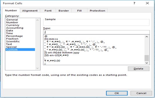
Step 13: Type ;in the Type box
Step 14: Click on OK
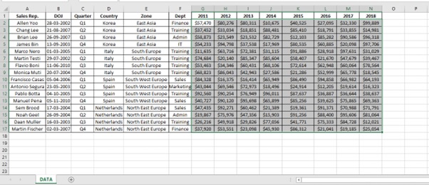
Step 15: Heat map is created based on values and displayed in Color.
Higher values are represented by Dark green color, Mid values are represented by Yellow color and low values are represented by Red color.
With the help of Colors we can easily analyse the performance of each Sales rep.
Scope of usage
- Can be used for visual display of data using colours
- Can be used for comparison of values
- Can be used to analyze data
- Can be used as conditional formatting